Home › Forums › General Questions › How to make configurator scene look more realistic/show details better?
- This topic has 4 replies, 4 voices, and was last updated 1 year, 2 months ago by
gf3d.
-
AuthorPosts
-
2024-01-15 at 8:07 am #69701
jezuk
CustomerI’ve created a configurator and it works great (just one little bug left :) ),
I want to improve the quality of the image, to make it look more realistic, and to show more definition/detail as currently it’s lacking in those areas.
Please can someone give me some tips?
Many thanks.
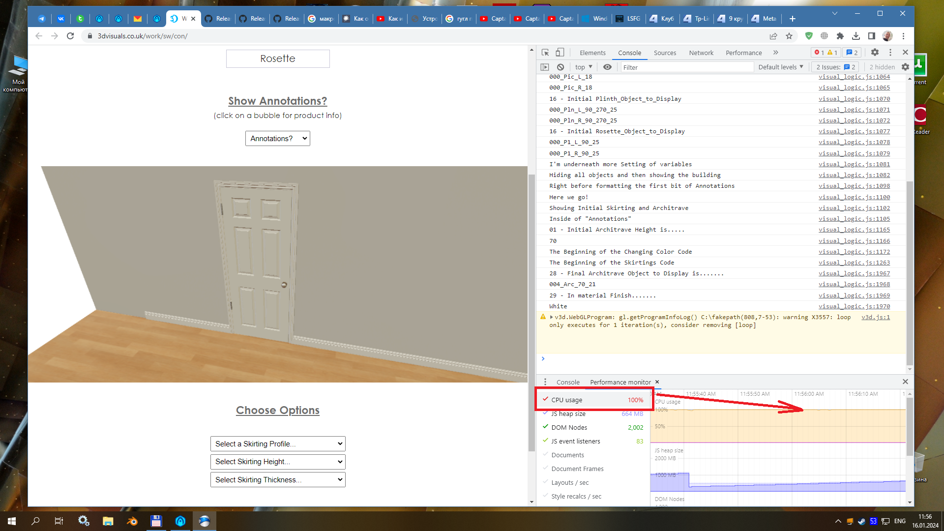
https://www.3dvisuals.co.uk/work/sw/con/
(warning – it does take a long time for the page to load because there are thousands of pieces of geometry – but these will be reduced drastically in number for the final version).
Many thanks.
2024-01-16 at 12:03 am #69713 xeonCustomer
Realism is in the eye of the creator or client depending on you situation.
From my perspective the issue is going to be related to: shadow map detail, lighting including environment map, modeling and texturing.
Your scene is using an environment map plus 1 light source that combined are creating a very flat washed out scene. You do not have any highlights and dont have any shadows. This combination gives it a very flat, “cartoon” like feel. If you want more realism you are going to need to start with an environment map that…by itself presents the wall door and molding in a more realistic manner. Light typically in room settings comes from either an above light source a lamp that is in the room and the light will arc arc across the walls.
Your walls are flat and will need to have a texture probably requiring a normal map that gives it the texture that represents the wall you are looking for. Combine this with either top down lights or some light fixutres you can then reduce the amount of light coming from your environment map. For the ultimate realism of shadows and light…I would suggests baking out your wall and shadow maps and then using those as textures in your scene. This way the realism you get with Arnold or other render will translate to V3D. It also allows you to delete your lights in your scene which will increase your overall performance while still looking great.
I used this process in my Escape Room
https://webgl.r66dapps.com/escapev1/
No,…I am not saying this is realistic either… just not flat and a method you could use.There is 1 environment map and 1 light although it looks like there are way more than than visually.
What you will need to do is create the scene in Max so it looks realistic your standards then you can work backwards baking atlas maps until it looks the way you want in V3D.
This process will also allow you to control the shadows and AO which you will need to control very tightly to make the modlings look their best.
I don’t know what your models look like but you will have to determine if you need realistic models or if you a simple plane and normal map will suffice.
Your settings for shadows will have to be played with once you get your lighting redone but if you do not have any moving components I would just bake those and not worry about dynamic shadows.
My two cents.
Xeon
Route 66 Digital
Interactive Solutions - https://www.r66d.com
Tutorials - https://www.xeons3dlab.com2024-01-16 at 7:38 am #69720jezuk
CustomerThanks Xeon,
I’m very used to creating realism using VRay, things getting rendered out.
With Verge3D I’m not so sure what I need to do – I’m using an Environment map, not sure I’ve got another light in the scene (I don’t believe I do).
And, yes, I did think about baking shadows into the walls around the moldings, but then would then have to have several walls and coding to cater for all the different widths/heights (thinking about it, it could get really complicated depending on what is chosen in the configurator).
I have played around with AO and with Shadows in the past and if anything it made things look even worse.
The modelling is perfect, those profiles are exactly as they need to be, it’s just that there needs to be better definition in my opinion for this configurator to have full benefits for the user.
I was thinking of having multiple cameras, and also of not even using realistic materials at all, but ones which are extremely good and show the overall form of the moldings to their best.
Thanks once again.
2024-01-16 at 7:49 am #69721kdv
ParticipantI have played around with AO
You’d better avoid using dynamic AO in Verge3D. In most cases it looks bad. No AA at all.
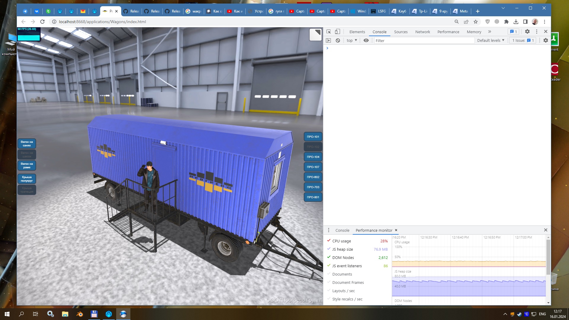
And you should consider optimizing you app. It’s too slow and consumes to much CPU time when showing only one door…

The modelling is perfect, those profiles are exactly as they need to be
From that distance nobody even sees how geometrically perfect your models are. For WebGL apps it’s not needed. The end user sees flat materials without normals and proper textures.

Puzzles and JS coding. Fast and expensive.
If you don’t see the meaning in something it primarily means that you just don’t see it but not the absence of the meaning at all.
2024-01-16 at 4:17 pm #69741gf3d
CustomerHi there,
i have to agree with Xeon,
it looks far better to create texture baked objects ( beauty and AO )
you can have them as simple legacy textures with self illumination….at my site you can see some nice samples
https://www.gf3d.de/html/vr_01.html
These projects have all just a environment lighting…..real time reflections.
Only the lites that move or change color are real lites….
Its worth while …loads quite fast and looks nice….Greets
Ger
-
AuthorPosts
- You must be logged in to reply to this topic.

